Sunday, April 22, 2012

Just An Exacto This Time


These are some pictures of my second model, this time, to full scale and proportion. Although, the top is not fitted and functional like the final lid will be this model gives a much better feel for how the final box will look complete with decorative ornament on the sides. I am still contemplating the arrangement of the three lines, but I would like them to vary in thickness and wood color. I will most likely use walnut and a lighter wood like cherry or maple. Once again I used hot glue and T-pins to adhere the sides and bottom. Working with this foam was much easier because the pieces were already 1/2" thick and I was able to use an exacto knife to make straight cuts through the coarser foam. I had established my dimensions with the first model an was able to finalize a plan for how much wood I needed to purchase making getting started on the final model much easier.

Break Out the Butcher Knife


Here are the preliminary models of my vessel. These models were made from Styrofoam typically used in artificial plant arrangements. I chose this material because it was a simple and fairly inexpensive alternative to clay and less time consuming than wood. The model shows the design of the final box, but is inaccurate in the dimensions  as I cut it from a pre-cut cube. The lid, white, is also Styrofoam, but was purchased in a flat sheet of about 1/2" in thickness. I cut the block in the same manner and order that I would be cutting the final wood box to get a feel for the most effective way to do so while assessing the thickness of the sides and how thin I would be able to make them. Here the walls are about 1/2" thick.  The adhesive I used to construct the model is hot glue with T-pins for support in the corners. I used a large kitchen knife to carve and cut the foam.

In The Name Of Wood; Purpose Statment

Initally, I wanted to construct a practical box. To quote the great modernist architect Louis Sullivan, “Form Follows Function.” I envisioned a box for a key shaped like a door knob or a key hole. After some unsuccessful sketches I
scratched the generic idea of a vessel to hold my spare car key. Thinking more sentimental, I then had the though to create a box in the shape of the Buddhist om after the shape of an old ring that I cherish. Once again I sketched over the idea and realized a jewelry box as also too generic. On the brink of exploding frustration my thought process did a 180. I can always use containers in my kitchen. The wooden box may not be able to hold food, but it would be perfect for prepackaged items such as tea, candy, coffee, granola bars, or even pop-tarts.

Tea for Thought 

I will construct a vessel that will accommodate the size and shape of a box, or loose tea packets. This container will allow me to contain my tea supplies in an easily accessible location and will also serve as a decorative ornament for my kitchen counter top.

And We're Off; Project #3


In the most simple way possible; “design and build a vessel that holds something of special meaning to you” was the prompt for this project. I was assigned to construct a wooden box complete with a functioning lid from any wood of choice. The boxes initial cuts must be made using a bandsaw and its size cannot exceed 5inx8in with no restrictions on height. I was very excited for this project and encouraged by the prompt to be creative yet within the realm of good craftsmanship. I knew I wanted to focus on a vessel that would be constructed properly, with minimal flaws, as well as radiate
personal flair. I began first with a concept map and  rough idea sketches.

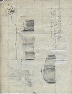
These are sketches of some preliminary ideas for my vessel. The top image is my final idea sketch and the box that I chose for this project. It shows some of the dimensions and how I would go about making cuts into the solid block of glues wood pieces.

Tuesday, April 10, 2012

Nature & Asthetics of Design

Art makes life worth living.

This is the point that was made in the article Nature & Aesthetics of Design. The author begins by assessing the material aspect of life, and by such means the physical material, not how much your double-shot latte from Starbucks cost (x3 per day). Physical materials are the building blocks of our civilization. Where would we be without glass and steel? Cotton and linen? Even our greatest homo sapiens ancestors assessed the value of material to accommodate their lifestyles. Animal fur was warm and and leather underside made for a though, long lasting piece of clothing. Precisely why moccasins are leather and not cotton.

The author then leads into talking about how these materials and the designs of these materials are what indirectly make us happy. It may seem far fetched, but it is completely accurate. We are happy when situations are convenient, when we get great service at a restaurant, or when it's snowing and our living room couch is always toasty. These are just a few obvious examples of how materials make us happy.

The author's next objective is to relate complete human happiness to art and design by working his or her way through the related topics of materials. Artists make the world a better place to be, is essentially the article's motto. Without these artists and designers creating things that are comfortable, pleasing to the eye or hand, and intriguing there would be very little substance to our lives. On the same level, without depression, pain, and moments of sadness there would be no appreciation for these works of art. If the weather was always temperate, we would never appreciate central heating and air conditioning.

Tuesday, March 13, 2012

Let's Play A Game; I Spy


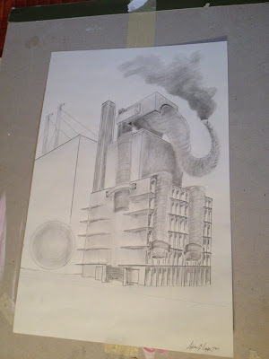
After we completed the constructing part of the assignment we began perspective drawing, taking simple chair styles and drawing them in relation to the horizon line. I played around with where the object sat according to the horizon line and decided on the best fit for my seat. Prior to engaging in the final drawing (image #2) I used Inda ink and a brush for some gestural drawings to better understand perspective and how other objects would fit into my final drawing. The intricacies of the front face of my chair posed a few minor issues but they were easily sorted out. Slightly more difficult perhaps was the angle at which I cut the horizontal tabs that held the vertical panels in place (~2" apart). I had cut them so that the back tabs were at about a 30 degree angle toward the ground and the front tabs so that they were about 30 degrees in the opposite direction. This is evident from teh photos, but for drawing purposes and to maintain correct perspective they are strictly perpendicular to the vertical panels. As is evident in drawing one, my first perspective drawing. There is an aspect of incorrect perspective, can you find it?... I'm sure. My error in this was taking the front most edge of the back post and taking it back to the incorrect vantage point on the left, instead of following the angle of the front and back edges of the seat to check myself. Lesson learned and the final drawing turned out well. Even with the added surprise of having to incorporate an elephant!

Here is an Elephant Song:

Thursday, March 1, 2012

A Chair, of Cardboard


The cardboard chair is complete! After an all-nighter in the design studio and copious amounts of recycled paper and discarded drawings my final product turned out looking nothing like my original idea that I was just certain was fool proof. After discovering the difficulty of making a solid cardboard box to serve as the seat for a four legged stool I essentially inverted the model and added layers of inserts for the chair seat. The three posts on the back are primarily for structural stability although with more time and effort could have been fashioned into a functioning backrest, as they are certainly stable enough for that. The chair is approximately 24"x 18"x 24" (seat) and the posts are 3.5"x 3.5" x 48". During the building process I came up with a fairly simple and sturdy idea for another kind of stool ( still about 36" in height), but as it was a matter of time and supply I was unable to construct it as well.

Thursday, February 23, 2012

Typography


A typography site I found that gives some great examples on how to make "dope" type graphics.
Check it out!

http://www.designdazzling.com/2010/05/30-dazzling-typography-posters/

A Page of Words for Inspiration

Water drips, power trips and I am slowly drowning in the
basement of some nineteen seventies living space where the air is always dry
and light switches send flames into the air and up my sleeve. They said it’s
the season, but my belief is that some self-righteous piece of shit has come to
sterilize me, claiming arson on the whole damn place. There’s burn marks on the
walls already, black fingerprints mapping out the way to hell, or heaven but I
have only experienced the latter. I’ve traced the path paced the carpet patio,
rug, wipe your feet, kitchen drawer, metallic in endless supply if only
everything could be check the coffee table check it off the list forgot the
shot glass in the microwave again. Curious eyes watch as an ounce of water
boils and the bacteria screams for mercy in the vacuum. This dirt devil handles
with care the likeness of the cast iron hand to those microorganisms sliming
their way through the ravines of the leafy greens in the back of the buzzing icebox.
The buzzing is now beating in regular fifteen-minute intervals and someone
forgot to empty the Tupperware that catches the drip drip dripping of the
frozen vegetables’ condensation now spilling over the lettuce and jam jars cemented
to the shelf by a corn syrup adhesive. Does anyone else notice the difficulty
in prying thrice frozen cubes from their plastic molds? Phenomenon. Like the
coffee grounds in the bottom of the wastebasket after the bag has fought for
two days to hold its ground and maintain original positioning. The poor dear,
it tried its best caved under the pressure. Digressing, the produce it rotting
from the inside out, cats in the cupboard rattling the pots like ding ding
dinging I’m searching for a vowel. What a sick and twisted game show, but I am
home in the haunt where ghosts leave their markings on the doorknobs and Dante
rests on the shelf. Back with the glass half full still hot enough to heat the
silver platter, now that’s what I call optimism. “Life's but a walking shadow,
a poor player, That struts and frets his hour upon the stage, And then is heard
no more. It is a tale Told by an idiot, full of sound and fury, Signifying
nothing” quote the past to rectify reality, signifying stresses of the present
not like this hasn’t been done before and more eloquently at that. Back to the
light switch now charred lamps shed better light the room afraid the next crack
from an electric blue flame may ignite the butane air filled from the flick
flick flicking of bic after bic. Speaking of death, cigarette break, calls for repeat
no one calls. Shoes, patio, patio, rug, shoes, forgot the shoes earlier too
much of a rush, kitchen clean hands with watered down dish soap and this time
no microwaving the water the hot is already hot enough and we cannot forget to
pick it from the counter ripened ready to trace back through the way finding
techniques little bread crumbs left at the foot of the dresser and towards the
edge of the architects’ desk. Johnny called just in time to say hello with the
good news before bedtime, lather rinse repeat. Play the stereo radio talk in
the foreground where dust is accumulating on the books’ window. How sad it is
the characters no matter how rounded seldom feel the sunshine or the harsh
winter glaze frosting the corners of the transparency. Backs to the bindings barricade
the light passerbys barely see the ladders chained to brick so helpless. This
is heaven warm and washed, up. Dizzy peering up at rock and plant jutting from
the side of a mountain waiting to one day cover the windowsill tomorrow. The
world is white to what wanderers wonder, busy contemplating the same shit as
before and why when all is pure and innocent and cool that such fire and dark can crowd like curtains.

Tuesday, February 7, 2012

Project Two; Task Number One Images


Here is documentation of the process of folding the cardboard into the bench seat.
1. lay flat
2. fold legs
3. flip legs under
4. fold seat down
5. fold down arm rest flap
6. connect tab for back rest

Project Two; Task Number One


The first task of this 3D design project was to build a 'seat' out of one sheet of 4x4' cardboard. Simple? No. Lets go ahead and make this fun; this structure had to support my own body weight, and no fasteners were permitted in the construction as well as no removing pieces of the cardboard. Challenging? Yes! Without these specifications I feel like there would have been too much leeway, and that forcing myself to abide by this set of rules made me pay more attention to detail and the material itself to maximize the potential of the cardboard.

Project One; Suplementary Images


My previous post was the out come of the first project of this Spring semester, but due to my ever present procrastination I failed to mention my process in achieving the final image. Below are some of my models and ideas I had prior to settling with my cubicle office desk.

Why It Didn’t Work:

Short explanations on why my previous ideas failed.

1. Facebook. Face It.

This idea ultimately failed because of its inherent lame-ness and my inability to take adequate photos of a computer screen. I found that no matter the distance, flash, or shutter speed the computer screen was always rendered as pixilated or lined. Also, taking on social media and defining its ever- changing news feed was both overwhelming and boring. The idea was to photograph my Facebook homepage on my laptop while I was in various places around campus, my apartment and friends’ apartment’s.

2. With The Band.

My next idea was an attempt at creating a stage from various pictures taken throughout an evening of live music at the Granada. This idea was destined to fail as I was not able to spend the duration of the show taking snapshot close ups of the stage due to the masses of people.

3. Soundboard= Bored.

I really enjoyed the colors in these photos taken while I was Djing one Friday morning, but when they came together as a collage it became overwhelming as a whole. There was too much color and chaos to convey a sense of space or time and the idea was scratched.

4. The stove was by far the second most successful,but it lacked a more personal touch. ( Although it is my kitchen, dirty counters and all) I tried to incorporate too much of the surrounding area other than the stove whose solid color and lack of detail made for a dull monotone outcome.


Sunday, February 5, 2012

Project One; Photomontage


The objective of this project was clearly stated as “To build an understanding of photography’s unique relationship to time and space by intentionally compressing, extending, and altering both. To build an understanding of how a 3-dimensional space is rendered on a 2-dimensional plane and how it relates to perspective.”

Personally, I find photography to be one of the most difficult mediums to work with and I completely reject the notion of photography being easy or just a matter of point and shoot to render a three dimensional object from two dimensional pieces of paper is one of the most difficult challenges I have faced as an artist and designer. I am not a photographer and have seldom worked with the medium.

All of the photos that I have compiled to create my final work have been rendered using a single iPhone. No editing, no effects, and no Photoshop. Since I was lacking a sufficient means of taking photos I decided to make use of what I did have and present it in its raw original, untouched form. From this I developed a theme to my project. I began to navigate around one word; raw. What better way to understand time and space than delving into a personal aspect of ones own life minus the theatrical effects?

To take the objective and skew it to conform to an emblem of a city or a campus was too broad and too overwhelming as well as too much of an un-relatable experience. For this project I decided to focus on myself (selfish, I know) based on the simple key word ‘understanding.’ I cannot say that I have gained much more of an understanding of myself or of my job from the subject that I chose to photograph for this project, but I do hope that this college; this arbitrary array of objects from my everyday life can impose a sort of stale excitement in the mind and eyes of those who look upon my work.
For this project I chose to photograph my workspace. Technology is evermore present in our lives and as time persists it only gains more momentum and we, human beings, are destined to succumb to its power and overwhelming sense of animate presence in our world. With my photo collage I hope to convey this presence. I work Monday thru Friday in a cubicle office with white walls, grey-blue fabric covered dividers, and windows that grant viewing privileges only to those who stand at a mere eight feet in height. The sun does not shine here in this office and when it does it is either too bright or too dull. There is a constant influx of phone calls from angry professors and irritated mothers that only amplify the clutter and chaos of the divided space. In my college I have incorporated various mediums (although this was not advised by the parameters of the project) because I felt that to convey this insanity, I would have to fill the voids with the objects I encounter on a daily basis. The phone calls and emails consistently pervade my life and as time passes I find it harder and harder to ignore their presence. From this project I have learned to accept the fundamental values of photography, but to also accept what the eye sees and what it means to the individual, attempting to exploit or explain its presence. It would have been simple to photograph a building and express its three dimensional persona and how its presence in space can be rounded out and expanded upon with numerous photos, but I abandoned this thought early on because of its lack of meaning in MY space and in MY time. My desk is where I spend my time; It is my space from 9am-5pm (as indicated by the Times New Roman name tag that reads ASHTON CAPPS a619c533) and this college is how I have rendered that space and its meaning in time.

Wednesday, February 1, 2012

Know What You Think, To Think About What You Know...(and then throw it in the trash)


I want to introduce this post by starting off with a summary of Plato's Allegory of The Cave. I have included a claymation video adaptation of the excerpt from his manuscript The Republic.
(www.youtube.com/watch?v=69F7GhASOdM&noredirect=1)
This interpretation does a well enough job of conveying the just of the story's moral fiber, but I do highly suggest reading the actual text or finding certain scholarly examples or interpretations.
I first came across this story in my freshman year of high school. It was required as were other worldly and depressing literature ( Dante's Inferno, 1984, Night, numerous Shakespearean writings and of course the infamous Flatland). Although these are typically college level reading I do appreciate my high school's literature department on overshooting the development of our pre-frontal cortex's at the time. The Allegory of the Cave, however, began to invade my life on many levels years after that class discussion. I have found various examples and ample situations to apply these ideas of perspective and truth. One of my favorite examples of this is Rene Magritte's surrealist painting the Treachery of Images (as seen above). The interpretation of the text states that "This is not a pipe," when in fact that is correct and Plato would most certainly agree. This is NOT a pipe, it IS, however, a painting of a pipe. Which, reflecting on Plato leads us to question whether or not the actual physical object is the real pipe or, rather, the idea that furnished the making of the physical object it the real pipe. (Dramatic pause to ponder....)
I will let your mind runaway with that though on your own blog time, for now I may make one more comparison. If we were to place a photograph of a pipe next to the painting next to the real thing next to the definition next to a man in a bathrobe holding a newspaper contemplating a mid-morning smoke; who is to tell us what is the actual pipe.
To formulate a definite opinion on this matter for the sake of time and reality we will say that the actual pipe is the 'real' pipe. This is to say that the photograph is the closest most tangible interpretation we human beings can achieve. This is not to say that this photograph of the pipe is in anyway a mirror of the object.
In the text On Photography by Susan Sontag, she elaborates on the factors that may skew a photographers attempt at mirroring reality. The most basic factor is life itself. Our capacity for emotion and feeling inherently skew reality on an individual level, although it may not be warped to you in particular, Johnny Shroom over there in the corner is interpreting this photo of a pipe as a living organism breathing fire and ready to destroy the human race in its entirety. Now, I may be exaggerating the analogy, but the point is clear. Just as emotions may change the look in your eye as you walk down the street thinking your anger is going unnoticed, this outward expression is able to prevail itself in photography as well as in other artistic mediums. The moral of this story is to attempt to view, at first, objectively and to take another person's interpretation with a grain of salt (or a dash of pepper, to each his own taste) and then attempt to view the same image or object from five other perspectives to gain a holistic understanding.

Thursday, January 19, 2012

Perspective; The Art of Visualizing


The first thing that comes to my mind when linear perspective and neoclassical artists are mentioned in the same sentence is probably the same image that every other college student who has ever taken an art history class, visualizes.
That is (figurative drum roll)...
David's Oath of the Horatii. Whether you were consciously taking notes or drooling, sponge-like, on your armrest knowledge of David's sharp use of linear perspective was probably retained through osmosis or something like it. Maybe by the sole fact it has been beat to death. A master piece, created by one of the greatest painters of the neoclassical era, my require more than one look. As my intro to modern architecture professor said " You would never say 'I had sex once, it was great' don't think I'll be trying that again" in reference to a student who questioned why we have to examine the same works as we did in the previous semester. A valid point. David uses repetition of the number three, three arches, three men, three women, and three diagonals, to define the space and create depth in the image. the light source in the painting also parallels these lines that radiate from the upper left hand corner. The receding lines of the tile floor converge at a singular point in the background and create the illusion of depth on a two dimensional surface. Here shadow, light and detail aid in this perspective, but those modern/ contemporary artists such as David Hockney use minimal detail and minimal shading and still create the illusion of depth. Linear perspective is key in his work. He notes in the video ( http://www.youtube.com/watch?v=cIfDdW9GKmA&feature=related) that he paints the background lines or outlines of the ground, pathways, and horizontal surfaces prior to doing anything else; establishing a plane.
 

Copyright (c) 2009 design. All rights reserved. Design by NodeThirtyThree + Free CSS Templates. Bloggerized by Free Blogger Template.